2015年5月4日星期一
2015年4月27日星期一
2015年4月15日星期三
2015年4月14日星期二
2015年4月5日星期日
2015年3月31日星期二
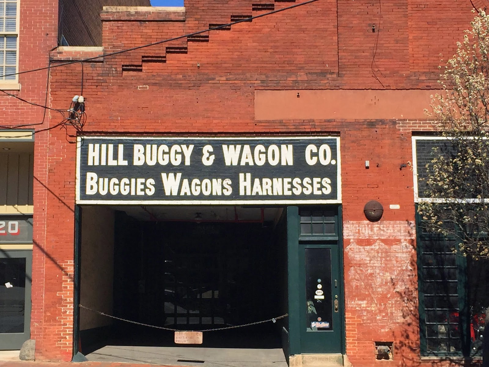
street signages
These sign are old, but their typeface are very big and easy to see, one problem is people hard to see it at night
This sign's font is OK, but I think the title need more bigger to emphasize what is this
use different fonts and between logo info and title, in addition black and red have a good contrast.
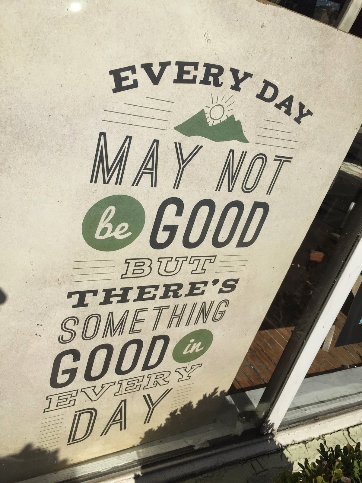
These signs used different fonts and put some images, easy to understand
too many fonts will make people read uncomfortable
Also a nice sign, but some letter are covered by the window and it is not easy to read
I like this sign, it is simple and easy to read
hard to read
订阅:
评论 (Atom)


